
Let’s be honest, we’ve all seen that one flyer or billboard with five different fonts, all shouting at the same time. Or a logo with cursive writing so squiggly, that even the brand owner can’t read it.
Typography isn’t just decoration — it’s communication. And in Nigeria, many brands are leaving money on the table by getting it terribly wrong.
Let’s dive into why typography matters, and how Nigerian designers and businesses can get it right.
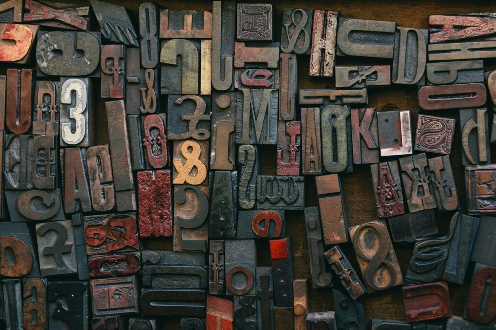
What Is Typography?
Typography is the art of arranging text in a readable, appealing, and purposeful way. It involves:
- Font choice
- Font size
- Line spacing
- Hierarchy
- Letter spacing (tracking)
- Line length, and more.
It’s not just about “what looks fine,” it’s about what reads well and feels right.
READ ALSO: How Typography Impacts Advertising in a Multilingual Nigeria
Where Nigerian Brands Often Go Wrong
1. Using Too Many Fonts
Some brands treat fonts like buffet options — piling up sans serif, cursive, display, and handwritten fonts in one design.
Why it’s a problem: It confuses the eye and weakens the brand’s voice.
Stick to 2 font families maximum — one for headings, and one for body text. Pair fonts with clear contrast (e.g., bold sans serif + clean serif).
2. Choosing Style Over Readability
We get it — that cursive font looks elegant. But if customers can’t read it in a split second, it’s a bad font for business.
Examples include Logos for beauty brands, churches, or boutiques with illegible fancy fonts.
Always prioritize clarity. Test your fonts on mobile, billboard mockups, and signage before finalizing.
3. Copy-Pasting Western Font Trends
Just because a tech startup in Silicon Valley is using “Inter” doesn’t mean your local fashion store in Abuja should do the same.
Match fonts to your brand’s tone, not just trends. A local food brand might benefit from warm, round fonts that feel homely — not cold, geometric ones.
4. Poor Line Spacing and Alignment
Ever seen a flyer where text is crammed like sardines or stretched like chewing gum? That’s poor line spacing.
Use consistent spacing and align text properly. White space is not wasted space — it’s breathing room.
5. No Typography Guidelines
Many Nigerian brands have logos but no brand guide. So designers guess fonts, leading to inconsistency across flyers, websites, and social media.
Build a basic typography system:
- Heading font
- Subheading font
- Body text font
- Colour and size rules
Then stick to it.
Why Good Typography = Better Business
✅ Builds recognition
✅ Improves readability
✅ Creates a consistent brand voice
✅ Makes your designs feel polished and professional
✅ Builds trust
Typography is silent branding. It whispers “quality” before people even read your message.
Nigerian brands don’t need more fonts — they need better typography choices. It’s not about being flashy; it’s about being clear, consistent, and confident.
So next time you open that design file, ask yourself: “Can my customer read this… and feel something?”